Dolby Laboratories
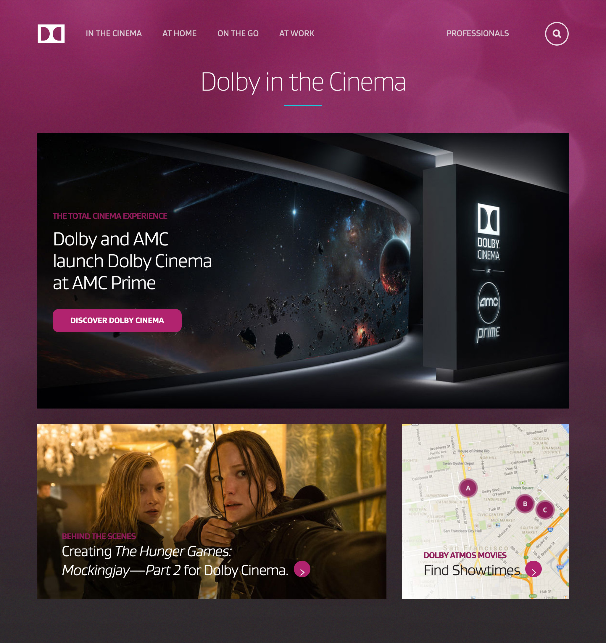
On a small team at Valtech, I re-designed Dolby.com's consumer and professional websites, distilling them into twelve annotated templates still in-use by Dolby today.
Challenge
At the end of 2020, Dolby Labs had a bit of a problem. It had been years since their last redesign, and in that time they had amassed a CMS of thousands of pages of complex, seemingly disparate content they couldn’t possibly update themselves. Within that collection, Dolby was maintaining what were effectively two separate websites: one for casual consumers, and one for technical folks.
Since the scale of this was beyond their scope, Dolby Labs recruited Valtech to re-organize and migrate all of their domains to the Sitecore engine.
Task
As a consultant at Valtech, I became the Lead Content Strategist on the Dolby Labs re-design with a 2 week deadline to:
- Audit the Dolby Labs consumer AND technical websites, and propose up to 12 page types to classify its thousands of web pages.
- Onboard to Sitecore’s CMS, and familiarize myself with hundreds of design components built specifically for Dolby Labs by developers.
- Build interactive prototypes of the 12 proposed page types in Sitecore, and work with developers to modify components as needed.
- Pitch this vision for Dolby.com to their marketing leadership, gain their buy-in, and lay out a long-term plan for migrating to Sitecore.
Conferring with my product manager via Teams, I held daily stand-ups with her and our front-end engineering lead, ensuring I had access to the styling behind our design components, and approval for my creative direction.

Action
With the relatively short timeframe allotted to me (in the middle of May 2020), I quickly executed on a few parallel workstreams:
- On a Zoom call with our engineering lead, I exported Dolby Labs’ domain sitemaps from their proprietary CMS, including all available metadata.
- With the branching of Dolby’s consumer and technical webpages clearly visualized for me, I discerned 10-12 buckets I could categorize them into.
- After winning approval for these 12 page “archetypes,” I built them in the Sitecore CMS, experimenting with a full library of branded components.
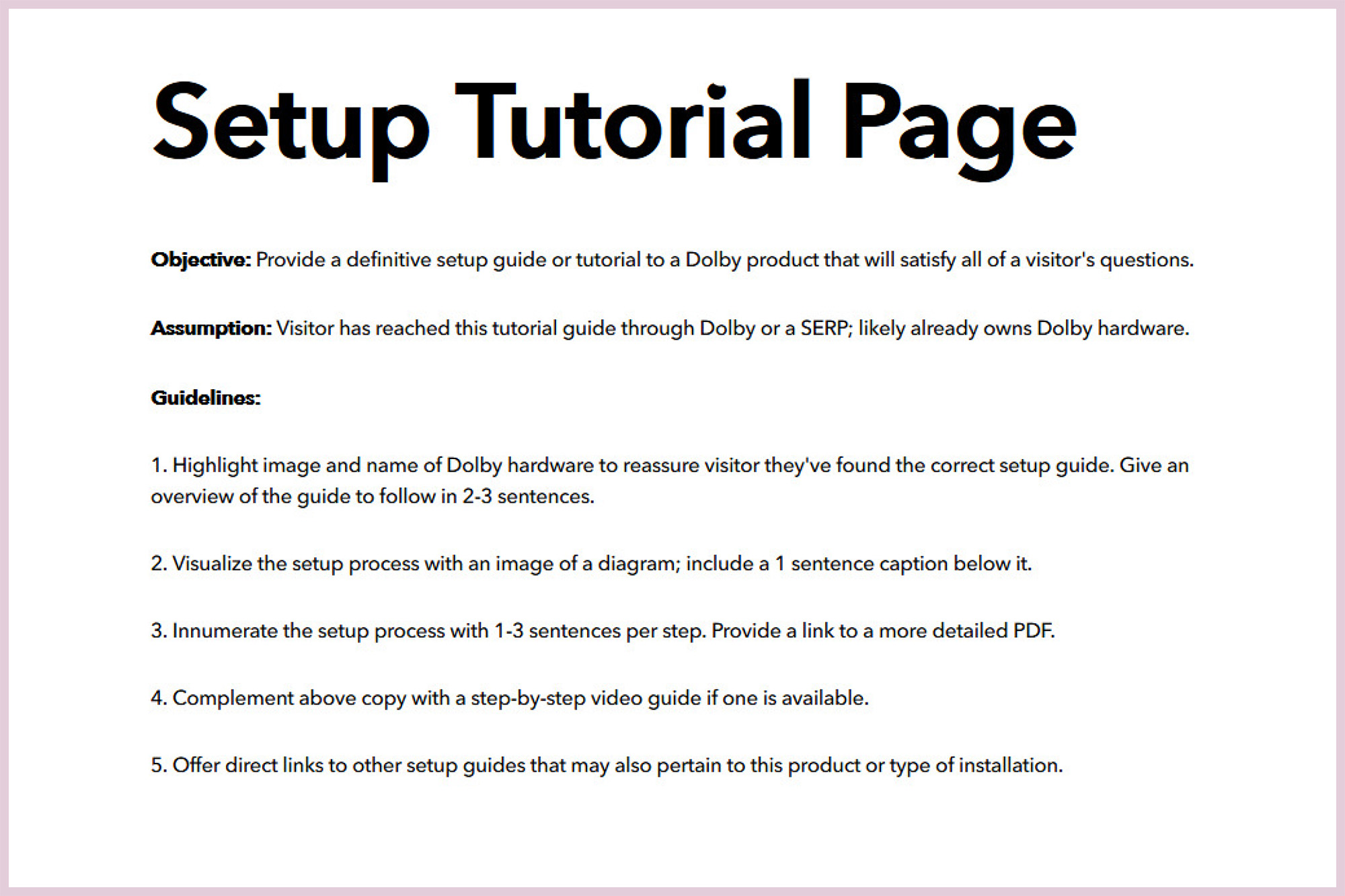
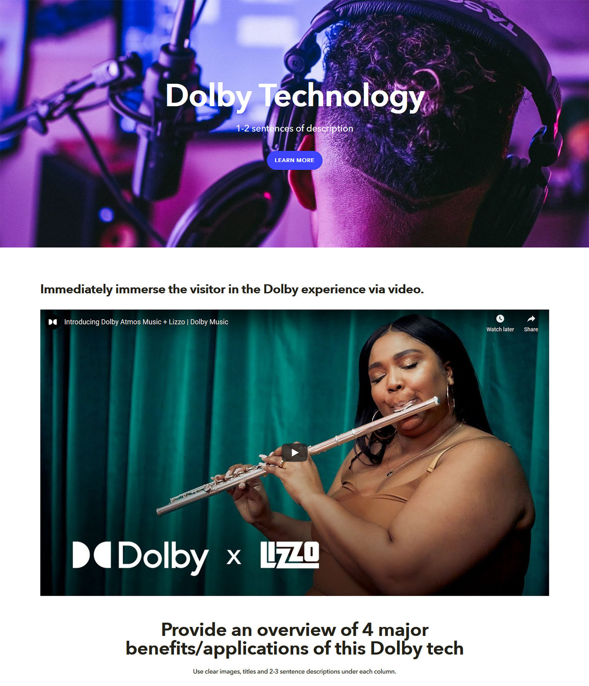
- I created variations for each of these 12 templates, and annotated them from top-to-bottom for future copywriters and front-end devs to maintain.
Upon reaching a consensus internally, I worked tirelessly with our front-end devs to launch a fully-functional demo of these 12 page archetypes on Sitecore. As needed, I requested new components, or modified existing ones, to achieve our unified vision.

Results
I pitched our set of 12 page templates, from cinematic landing pages to Dolby Atmos technical specs, and won approval from the Dolby Labs marketing team.
- We migrated Dolby Labs, and converted thousands of webpages to fit my 12 page templates, within the next 3 months.
- My visual designs, layouts, and themes have been retained and applied by Dolby Labs for over 4 years and counting.
- Dolby Labs has automated the launch of new domains for developers, like Dolby.io, and Dolby Experiential for casual fans.

Takeaways
Given the right vantage point, even an immense enterprise-grade ecosystem like Dolby Labs can be deconstructed. Auditing under tight constraints forces you to look past the fluff and see the function of a web page for what it is. Once you have a shared vision for a redesign, you can work wonders within a single sprint.
Interested in working together?
Get in touch today.
As human beings of the Digital Age, we're all teeming with thoughts and ideas. I enjoy bridging the gaps between them.